


Design Newsletter - 13 (May, 2025)
Hello! 👋🏻 Welcome to my monthly "Design Newsletter", where I compile the latest information, trends, and inspiration from the dynamic world of design. I am excited to share my discoveries with you!

Design, Technology, and Art News
Figma CONFIG 2025 (🔗 Dylan Field)
This month’s one of the biggest highlights is Figma’s Config 2025 conference. I joined it in San Francisco, and it was amazing!
Figma dropped major updates at Config 2025:
Figma Make turns text prompts into coded prototypes.
Figma Sites lets you publish responsive sites from your designs.
Figma Draw adds expressive vector tools.
Figma Buzz helps teams create on-brand assets at scale.
New Grid: Live resizing and better layout controls for responsive design.
Since I design in Figma and generate my website in Framer, I recently compared both tools. Check out my latest article here 🤓.
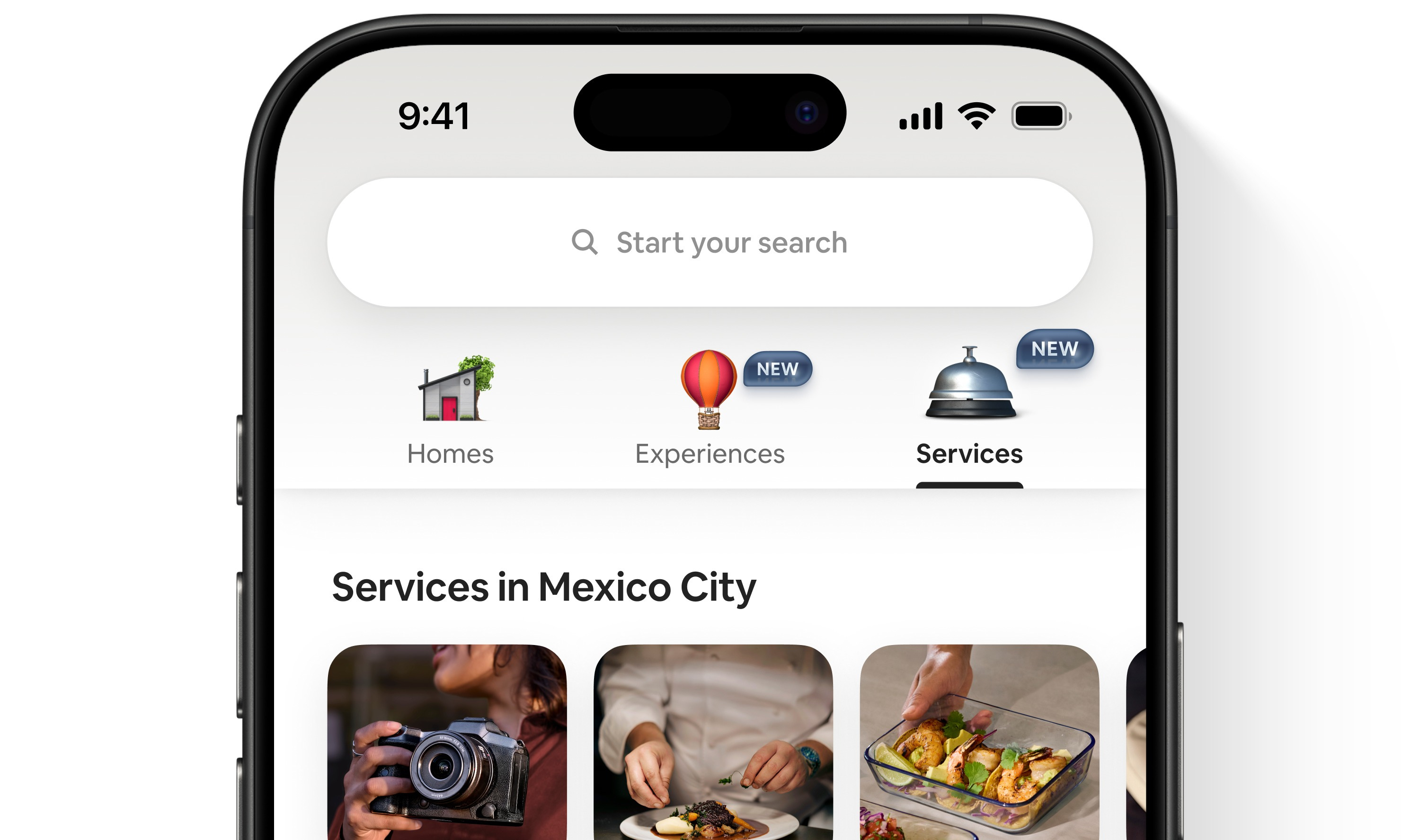
Airbnb 2025 Summer Release (🔗Release note)

Every quarter, I eagerly await Airbnb’s release notes, and this summer’s update is significant.
Airbnb now offers Services like private chefs and massages in 260 cities, and Experiences with locals and even celebs.
The redesigned app brings it all together with smooth animations and new playful icons. Designers are loving the fresh, soft look. 😍
Google I/O 2025 (🔗 Google Blog)
There’s an important announcement: Google just dropped a wave of new features and tools at I/O 2025.
Here’s a quick recap:
Gemini 2.5 Pro: Smarter, faster, with “deep thinking” for complex tasks.
AI Overviews in Search: Conversational, AI-powered answers with follow-up support.
Veo & Imagen 3: AI tools for high-quality video and image generation.
Project Astra: Real-time, multimodal AI agent with memory.
Wear OS 5 & Android 15: Smarter health tracking, better performance.
Android XR & Smart Glasses: AR meets Gemini, powered by Google + Samsung.
It’s clear. AI is now at the core of Google’s entire ecosystem, and I can’t wait to try these tools. 🤖
Sam and Jony Introduce IO (🔗 OpenAI)
One of this month’s biggest news: OpenAI is teaming up with Jony Ive to build a new AI-powered device.
The project, backed by $6.5B, aims to create a screen-free, context-aware product that could redefine personal computing, something between a smartphone and a laptop.
Super curious to see what they’ll build. 🤩
Notion 2.51: AI Meeting Notes, Enterprise Search & more (🔗 Releases)

Notion’s latest update introduces several powerful AI-driven features designed to enhance productivity:
AI Meeting Notes: Automatically transcribe and summarize your meetings, seamlessly integrating with Notion Calendar.
Enterprise Search: Search across Notion and connected tools like Microsoft Teams, SharePoint, OneDrive, with upcoming integrations for Gmail and Linear.
Research Mode: Draft detailed documents by analyzing your workspace, connected tools, and the web.
AI Home: A centralized hub to interact with Notion AI, ask questions, and build custom workflows.
You can try these new features for free now. 🤓
The new Netflix TV Experience (🔗 Netflix)

Netflix has unveiled a major redesign of its TV interface, the first significant update in over a decade, aiming to enhance user experience and content discovery.
Key Features of the New Netflix TV Interface:
Simplified Navigation: Top menu for quick access to Search, Shows, Movies, Games, and My Netflix.
Smarter Recommendations: Homepage updates in real time based on your viewing.
My Netflix Hub: One place for saved titles, reminders, and Continue Watching.
Richer Info: See synopses, duration, awards, and cast at a glance.
Miro Auro ( 🔗 Miro Blog)

Miro has introduced Aura, its new product design language aimed at enhancing creativity and collaboration within its platform. Aura brings refreshed colors, fonts, icons, and visuals to create a more cohesive and elevated design experience.
Key principles of Aura include:
Energize Minds: Fostering momentum through playful and creative design interactions.
Illuminate Moments: Anticipating user needs to accelerate team creativity.
Feel the Pulse: Creating a tangible connection to work with tactile objects and interactions.
Spark Emotions: Encouraging authenticity and individual creativity in a collaborative space.
Framer (🔗 May Updates)

Framer’s May updates brought powerful new tools for designers:
Wireframer: A new plugin for quick, low-fidelity wireframes. Great for early concepts and team alignment.
Vectors: Now easier to create and edit with enhanced vector tools, perfect for icons and custom shapes.
Workshops from Assets: You can now launch workshops directly from the Assets panel, speeding up prototyping.
Advanced Analytics: Get deeper insights into site traffic, user behavior, and engagement, all within Framer.


Interface Insights
When everything screams, nothing is heard: strategic use of color in data (🔗 Dmitri Spiropoulos)

Dmitri Spiropoulos emphasizes the importance of intentional color use in data visualization. 🎨 He argues that overusing bold and bright colors can overwhelm viewers, making it difficult to discern key information. By strategically applying color and contrast, designers can enhance clarity, focus, and accessibility in their visualizations.
He illustrates this with a simple matrix exercise, demonstrating how thoughtful color choices can guide attention and improve comprehension.
Duolingo’s small UI switch that changes everything (🔗 Sam Liberty)

Duolingo replaced its “hearts” system with a new energy mechanic: users now start with 25 energy, which depletes with mistakes or lessons and can be refilled with correct answers.
The new system uses positive framing, variable rewards, and randomness to boost engagement and habit formation, while still nudging users toward premium. It may even improve learning by allowing more mistakes.
This subtle change shows just how intentional today’s digital product design can be; what feels like a game is a carefully crafted behavior loop.


Knowledge Drops
Want to have a strategic design voice at work? Talk about desirability (🔗 Kai Wong)

Desirability is more than visual appeal. It’s a strategic UX tool to guide product decisions.
In this article, Kai Wong explains how measuring desirability helps designers influence roadmaps by showing what users truly want. It supports prioritization alongside feasibility and viability, and ensures you’re solving the right problems.
Desirability ties into user motivation, brand perception, and competitor differentiation, and it’s key to having a real voice at the table.
Caring (🔗 Aras Bilgen)

Caring is at the heart of good design, writes Aras Bilgen. In his latest piece, he breaks down four levels of care, from immediate users to non-users impacted by a product’s ripple effects.
In a world leaning into AI-driven “good enough” solutions, he argues that intentional, human-centered touches, like a more personal farewell to Skype users, are what truly set great design apart.
The article reminds designers that care can start anywhere, and intentionality is what separates meaningful experiences from disposable ones.
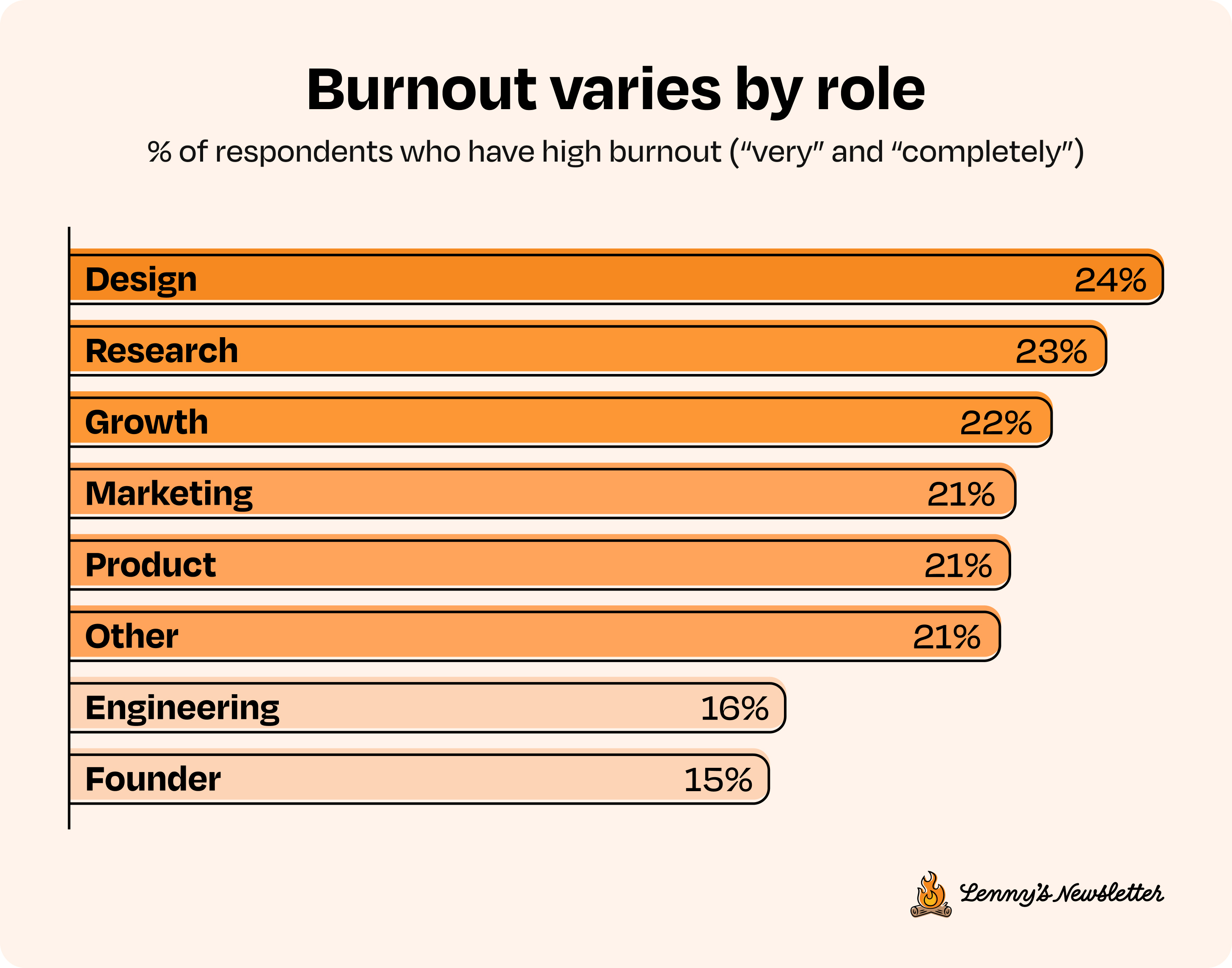
How tech workers really feel about work right now (Lenny’s newsletter)

A new survey by Lenny Rachitsky and Noam Segal reveals how tech workers really feel in 2025:
45% report burnout, especially mid-career pros
Founders are the happiest and least burned out
Only 26% rate their managers highly
Hybrid work wins for satisfaction
Smaller companies foster more joy and belonging
Career clarity is lacking, leaving many unsure of their growth path
The message is clear: tech needs more care, better leadership, and clearer career support.


Tool & Source Time

Google Stitch is a free AI tool that turns text prompts or sketches into polished UI designs and production-ready HTML/CSS code.
You can generate layouts, export to Figma, and edit code in your IDE—all from a simple description.
It’s now in public beta at stitch.withgoogle.com.
Ditto is a tool for managing product copy across design and development.
It lets teams centralize text, sync with Figma, collaborate on drafts, and streamline localization, all from one source of truth.
Trusted by teams at Microsoft and eBay.
Try it at dittowords.com.

Skill Sharpeners
Google Free AI Courses (🔗 Rubén Domínguez Ibar)
Rubén Domínguez Ibar shared a LinkedIn post highlighting 10 free AI courses released by Google, designed for beginners. These courses cover topics like generative AI, large language models, responsible AI, image generation, and more. Each course is concise, with some as short as 45 minutes, making them accessible for those looking to enter the AI field.
Intuit’s Content Design System
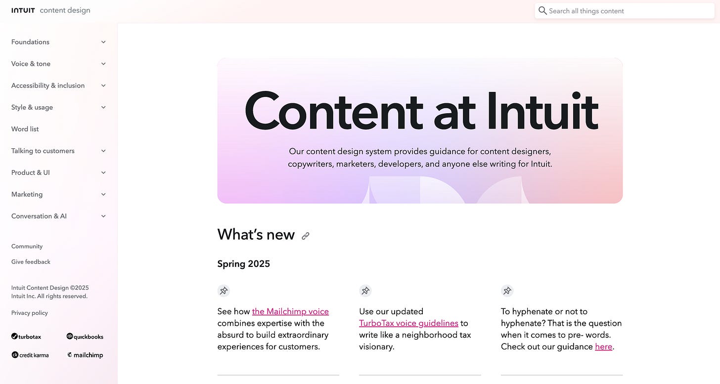
Intuit’s Content Design System is a public resource for writing clear, inclusive, and user-focused product content.
It includes guidance on voice and tone, accessibility, UI copy, and style, used across products like QuickBooks and TurboTax.
Explore it at contentdesign.intuit.com.

Looking forward to connecting again next month! 🫶🏻 Many thanks for being a part of this journey! ☺️