


Design Newsletter - 5 (September, 2024)
Hello! 👋🏻 Welcome to my monthly "Design Newsletter", where I compile the latest information, trends, and inspiration from the dynamic world of design. I am excited to share my discoveries with you!

Design, Technology, and Art News
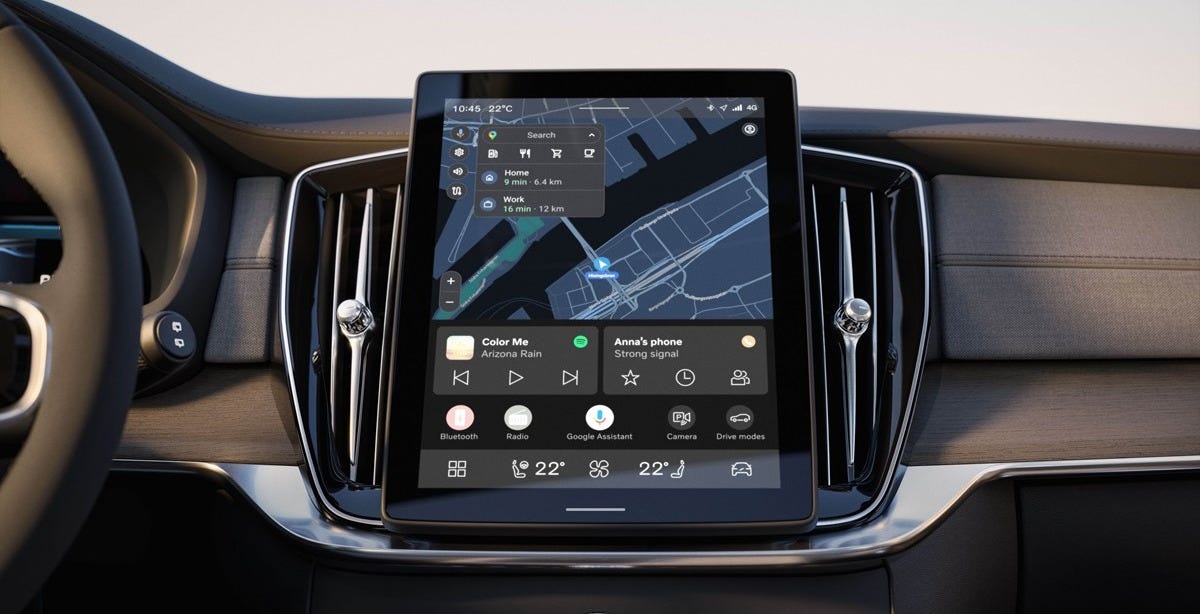
Volvo’s Next-Gen User Experience Rolls Out Across Millions of Vehicles (Volvo Cars)

Volvo’s latest user experience includes a redesigned infotainment system that has expanded to millions of vehicles, starting with the EX90 and EX30. A key design element is a larger, 11.2-inch high-resolution display that provides intuitive access to navigation, media, and phone apps without excessive touching. An adaptive layout improves focus and safety by minimizing distractions. A dynamic contextual bar and optimized controls enhance usability, particularly for plug-in hybrid drivers. This user-centric design will be available across models via over-the-air updates, improving functionality.
Just our type: The story of creating Figma Sans (Figma)

Figma has introduced “Figma Sans,” a new custom font designed by Grilli Type, as part of its recent brand overhaul. It was fascinating to learn how the Figma team collaborated with Grilli Type to create a custom typeface that balances expressive details with functionality. The focus on flexibility, legibility, and adapting to different screen sizes and surfaces shows a deep understanding of user needs. This new font style feels like a smart and sophisticated step forward for Figma, reflecting its growth as a platform beyond just designers.
PayPal's new refreshed brand identity (PayPal)
Pentagram has partnered with PayPal to create a refreshed visual identity that reflects simplicity and innovation. The redesign includes a refined logo, updated color palette, and new typography to improve consistency and recognizability across platforms. I personally appreciate how the redesign focuses on accessibility and inclusivity, ensuring the brand feels welcoming to all users. The updated design reflects PayPal’s commitment to creating a clear and consistent visual presence that aligns with its services and mission.
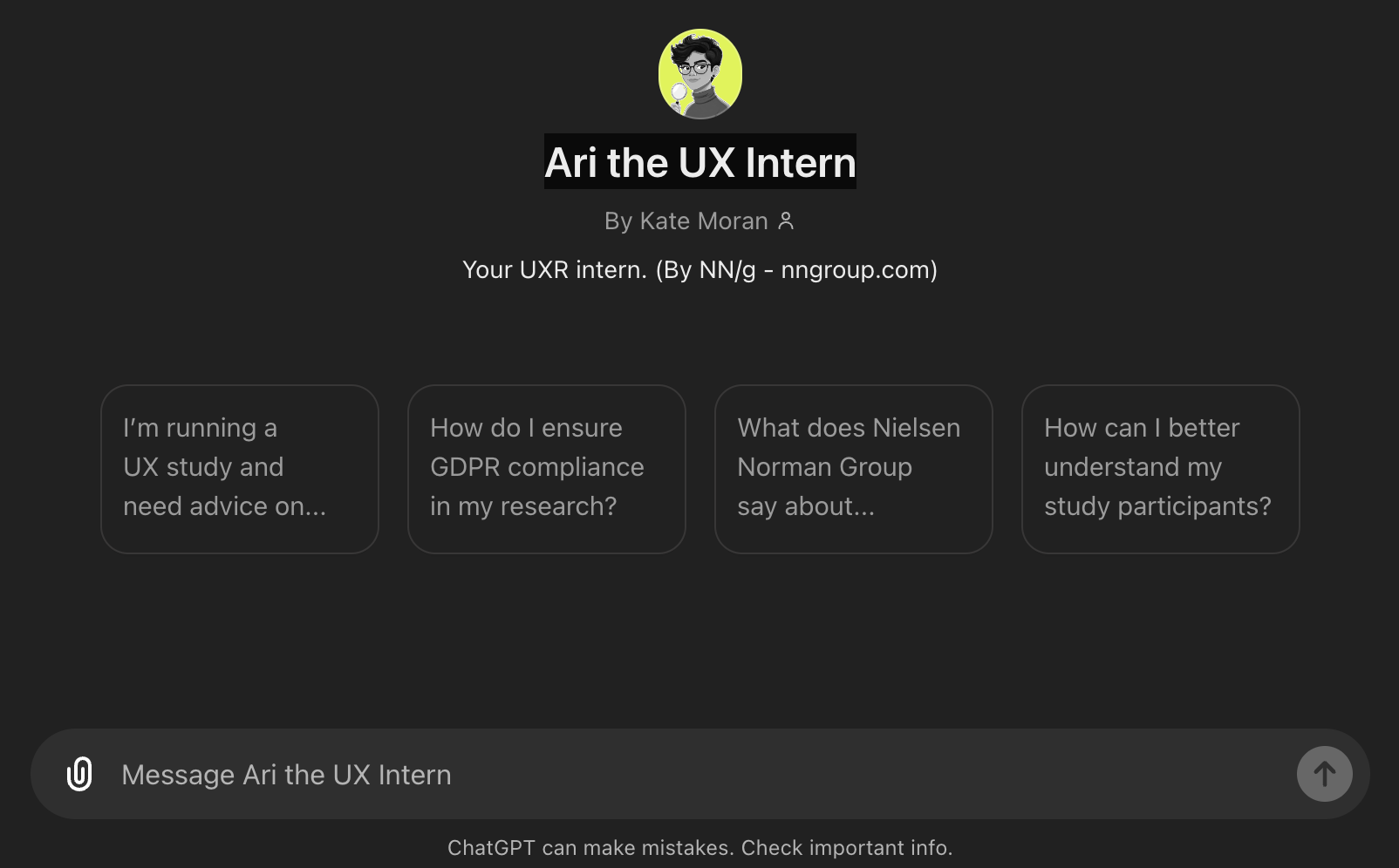
Meet Ari: Your AI-powered UX Intern

Ari, developed by Nielsen Norman Group (NN/g), is a new AI tool designed to assist UX professionals by handling initial tasks like research planning and design reviews. Acting like a real intern, Ari can complete a wide range of tasks quickly but requires supervision and guidance due to his lack of emotional understanding and deep contextual awareness. While offering speed and efficiency, Ari’s outputs should be treated as drafts rather than final products. This AI intern is a promising step toward integrating AI into UX work while preserving the need for human expertise.
Apple introduces California driver’s licenses and state IDs in Apple Wallet (Apple)

Apple has officially brought California driver’s licenses and state IDs to Apple Wallet. Now, residents can add their IDs to the Wallet app on iPhone and Apple Watch, allowing them to use their digital IDs in a variety of secure situations, such as airport security at select TSA checkpoints. This expands the capabilities of Apple Wallet and provides a more convenient and secure way to present ID. The integration is part of Apple’s ongoing effort to make everyday tasks easier through digital tools while maintaining high levels of privacy and security.


Interface Insights
Duolingo’s onboarding testing — what’s stuck? (UX Collective)
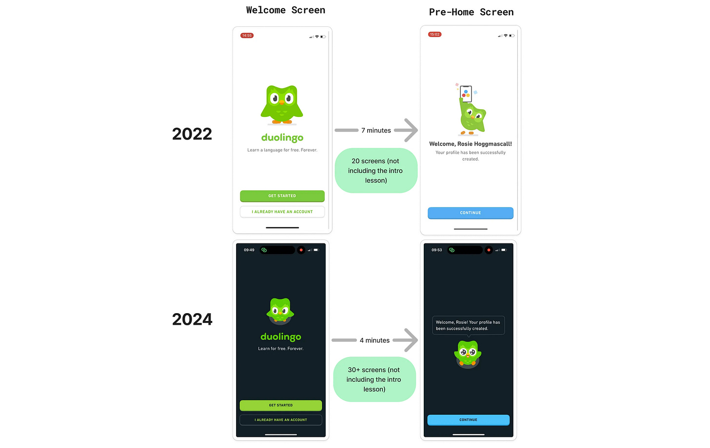
Duolingo’s onboarding design for 2024 delivers a faster, more engaging experience than it did in 2022. The UI now emphasizes fluid interactions and personalization, making users feel like they’re in a two-way conversation with Duo the Owl. Animations are snappier, and the shift from feature-heavy to value-focused messaging helps users grasp the benefits quickly. I love that the onboarding experience now feels more like a friendly conversation, increasing both engagement and retention. The design prioritizes user experience without sacrificing functionality or clarity. 🦉
Google’s AI Search experience is an utter mess I can’t stand (Android Police)

Google’s Search Generative Experience (SGE) is facing several challenges, particularly with the consistency and accuracy of its AI-generated content. The responses can be unclear or incomplete, raising concerns about the overall reliability of the service. Additionally, users have noticed discrepancies compared to traditional search experiences, with SGE sometimes providing too much information or content that feels disconnected from typical search expectations. These issues highlight the complexities of integrating AI into everyday search functionality.
Gestalt Principles for Visual UI Design (UX Tigers)
Reading about Gestalt principles can be a good reminder for us. When I saw these concepts discussed on Jakob Nielsen’s blog, I realized that it was a great opportunity to refresh my understanding. These principles are essential for creating intuitive, user-friendly interfaces that use natural human tendencies to perceive organized patterns. Understanding and applying Gestalt principles can increase the clarity and usability of digital products.

Knowledge Drops
The 80/20 rule in design job interviews (UX Collective)

The article explains how the Pareto Principle (80/20 rule) applies to design job interviews. It emphasizes that 80% of interview success comes from focusing on the case study presentation, which typically only makes up 20% of the questions. By preparing a strong, relevant case study that emphasizes the design process, problem-solving, and storytelling, candidates can impress interviewers. The article recommends devoting most of the preparation time to the case study while ensuring good communication and flexibility during the presentation.
How To Measure And Show UX Impact (Vitaly Friedman)
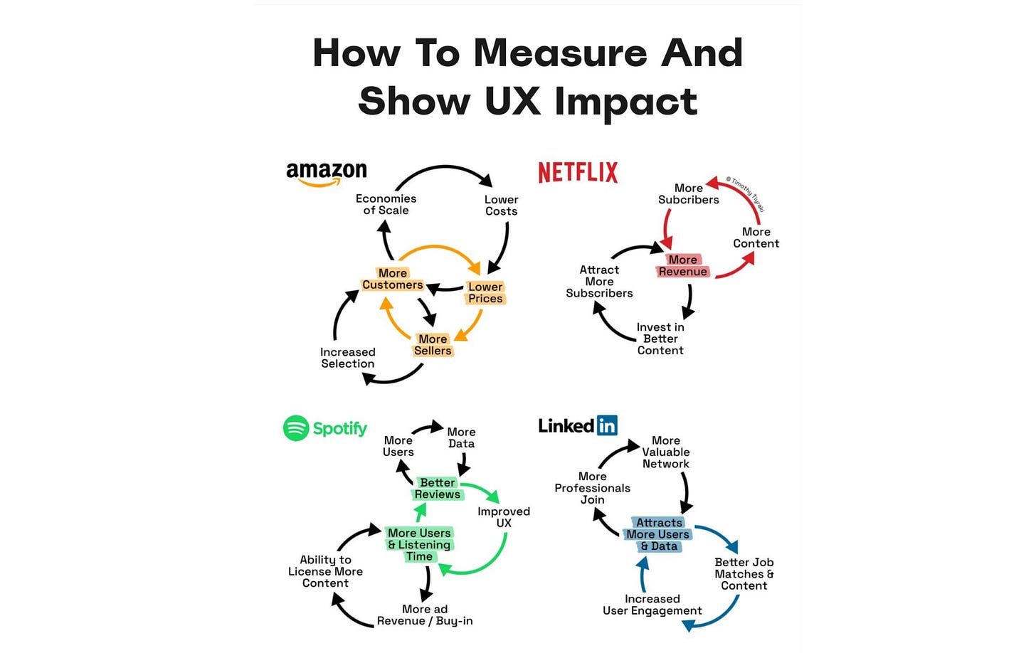
I recently read one of Vitaly Friedman’s recent posts on measuring and demonstrating UX impact, where he provided insightful links to design KPIs, KPI trees, and business wheels. His approach emphasizes focusing on core user tasks that align with business goals and aiming for a success rate above 80%. We can demonstrate UX improvements' value by tracking metrics like task success and completion times and capturing before-and-after snapshots. He suggests using design KPIs tied to broader business metrics, visualizing them through KPI trees or charts, and tying UX work to business wheels to showcase its role in driving growth and achieving strategic goals.
Design Strategy for Design Portfolios (Dan Saffer)
Dan Saffer shares key tips from his 15 years of hiring experience, emphasizing the need for concise, impactful portfolios that grab hiring managers' attention. He suggests having two versions: a brief online portfolio to secure interviews and a more detailed one for presentations. I like how he clearly outlines the important points—like focusing on problem-solving and results in case studies—and writes in a friendly, honest tone, sharing his real opinions. His advice on personalizing the "About Me" section to show you're a good fit for the team was particularly insightful.


Tool & Source Time
The "Design Patterns Catalogue" by IF provides practical solutions for building trustworthy digital services, covering areas such as consent, data access, and security. It covers key design considerations for transparency, security, and user control. The catalog is categorized by key actions like influencing decisions, logging in, and managing data access, and offers practical solutions to improve user experience and trust. I had a chance to explore some of these patterns, and they are genuinely helpful for creating user-centered and secure digital services. Each pattern is well-detailed with real examples and insights that can be applied to different stages of the design process.

The "Shape of AI" is a UX pattern library for designing AI-driven user experiences, focusing on trust, transparency, and user control. It explores various patterns that enhance user interaction with AI, focusing on elements like prompts, inputs, and feedback mechanisms. It's a great resource for designers working with AI systems to create user-friendly and reliable experiences.
PS: Their upcoming UI library will provide even more tools for crafting intuitive AI interfaces. You can subscribe to be the first to know when the Shape of AI Library is available. 🤖
UX Deliverables: Glossary (NNGroup)
The "UX Deliverables Glossary" by Nielsen Norman Group is one of the best resources I've found for learning about UX deliverables. 😍 It's incredibly useful for quickly referencing and understanding key design tools like wireframes, personas, and journey maps, while also offering best practices for each. This glossary is a must-have for anyone looking to improve their UX design process and communicate more effectively.

Mobbin has introduced a new feature that lets users view A/B test results directly on their platform. ✨ It simplifies the process of designing experiments, selecting variables, and determining test outcomes with clear guidelines. The platform emphasizes best practices for running controlled tests to optimize user experiences and improve product performance. It’s a great resource for anyone looking to make data-driven design decisions through structured experimentation.


Skill Sharpeners
Business Thinking For Designers

Free practical guides to business for designers, with strategies to effectively communicate with stakeholders and techniques that you can put right to work — and design a winning design team strategy.

This month, I came across a very interesting website called Sneakpeek Design. It offers early previews of design tools and even shares Figma files from top designers, making it a great resource for staying updated on the latest design trends and tools. You can subscribe by entering your email on the homepage to receive exclusive updates directly in your inbox.

Looking forward to connecting again next month! 🫶🏻 Many thanks for being a part of this journey! ☺️
Just a quick reminder about subscriptions – if you're not already on board, drop your email using the button below and join the fun (it's totally free)!