Design Newsletter - 7 (November, 2024)
Hello! 👋🏻 Welcome to my monthly "Design Newsletter", where I compile the latest information, trends, and inspiration from the dynamic world of design. I am excited to share my discoveries with you!
Design, Technology, and Art News
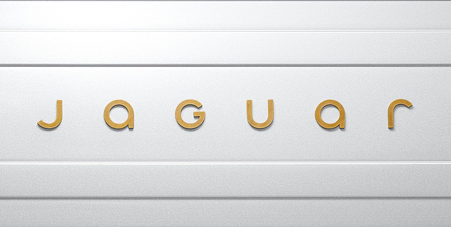
Jaguar is now JaGUar (Jaguar Media)
Jaguar has announced a bold new brand identity under the banner of ‘Exuberant Modernism’, a new direction for the iconic brand. It’s one of the most talked about stories in the design world this month🧐. While praised for its originality and alignment with an all-electric future, the rebranding has faced criticism for issues such as logo legibility, inconsistent typography, and a style that feels more fashion or marketing-friendly than EVs. The mixed reactions highlight its bold yet polarising direction.
eBay Design System (eBay Playbook)
This month, eBay has launched a new in-house design system, “eBay Evo,” to modernize its platform and enhance customer experiences. A great example of a comprehensive design system, it includes in-context mockups, data visualization, metrics, bulk editing, video player UX, motion, interactions, marketing UI, and email design. Focused on the creative platform “Things.People.Love,” this system combines global branding while allowing for local flexibility, emphasizing innovation, trust, and user connection.
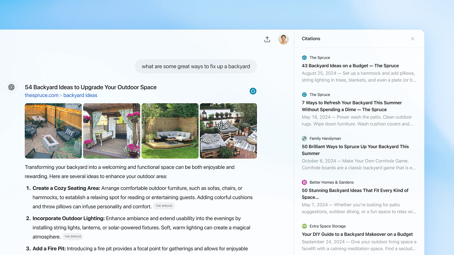
Introducing ChatGPT search (OpenAI)
OpenAI has introduced ChatGPT Search, adding real-time web browsing for up-to-date answers like news, weather, sports scores, and stock prices. This development marks a significant shift in how users interact with AI, with ChatGPT’s interface increasingly adopting familiar elements from traditional search engines.
OpenAI plans to develop ChatGPT search by focusing on areas such as shopping and travel and aims to leverage the advanced reasoning capabilities of AI models for deeper investigations. I look forward to seeing how they design and evolve the interface and experience. 🤩
Tripadvisor - 20 achievement badges (Tim Boelaars)
I am impressed by Tim Boelaars’ work, and his latest collaboration with Tripadvisor is particularly impressive. He designed 20 achievement badges to celebrate contributions from the community, such as writing reviews and uploading photos. He also created five seamless patterns to be used across the platform’s app, decks, and social channels. This initiative not only increases user engagement but also adds a personalized touch that reflects a deep understanding of hospitality and community building. 🏨
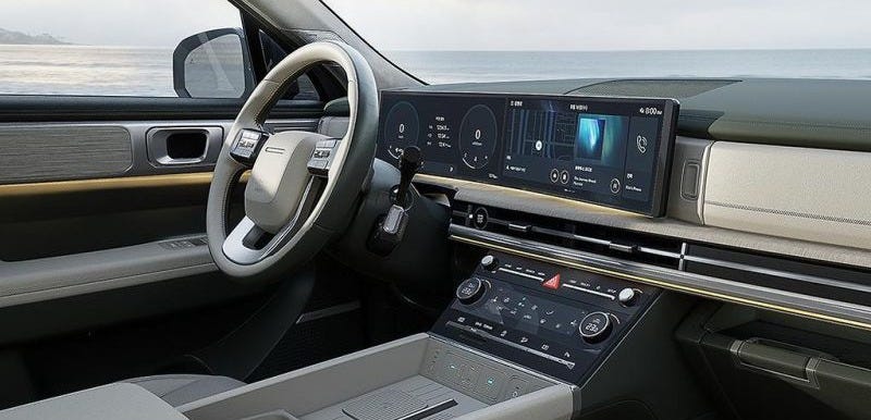
Hyundai made a big bet on touch screens in cars. (Korea Joon Gang Daily)
Hyundai is reintroducing physical buttons in its cars after feedback suggested touchscreens could be distracting and frustrating while driving. The refreshed Ioniq 5 now features more analogue controls to improve safety and usability. I think the key isn’t touchscreens or buttons, but designing interfaces that prioritise simplicity, clarity and safety to minimise distractions, regardless of the technology used.
Real life conversations with Lily (Dualingo) (Link)
Duolingo has introduced an AI-powered Video Calling feature that allows users to engage in realistic conversations with the Lily character, enhancing conversational practice within the app. This innovation contributed to Duolingo’s strong Q3 2024 financial results that exceeded expectations with a 54% increase in daily active users and a 40% increase in revenue. 
I find this development innovative because AI facilitates more interactive language learning experiences. Interestingly, my chats with ChatGPT reflect this functionality, allowing me to discuss topics and get grammar corrections or expression suggestions, similar to Duolingo’s approach. 🤓
Interface Insights
How Airbnb designs products (Felix Lee)
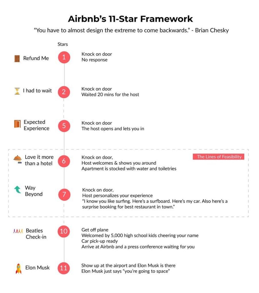
Airbnb’s design process focuses on building trust, the cornerstone of its platform, by overcoming the “stranger danger” bias through thoughtful design. Trust is fostered by prioritizing first impressions, encouraging complete user profiles, and implementing a review system where feedback is shared only after both parties have left a review. Airbnb designs act like a “mutual friend,” balancing the right amount of information while guiding users with features like text box sizes and prompts for effective disclosure. Their “Eleven Star Framework” aims to exceed expectations and create experiences that users feel compelled to share. I really like this approach, as it blends design, psychology, and innovation to create meaningful connections. 😍
I was shocked when I cancelled my Loom membership (Rosie Hoggmascall)
I came across Rosie Hoggmascall’s recent article on Loom’s cancellation flow, and as one of the writers I always try to follow, her insights are amazing! 🤩 She highlights how Loom delivers a thoughtful cancellation experience with a user-friendly cancellation flow, clear messaging, and a respectful tone. After reviewing the screens, content, and UI, I was impressed by how they kept users informed at every step and let them know exactly what would happen after cancellation. There are no hidden messages or feelings of guilt, like “We miss you” or “We’re leaving.” This approach respects users and makes a lasting positive impression by showing the importance of cancellation in the user experience.
UI Grid Types: Fixed and Fluid (Nick Babich)
I came across some practical suggestions from Nick Babich for creating effective responsive grid systems. Start by defining breakpoints based on content (e.g. mobile 576px, tablet 768px, desktop 992px) and using column grids (12 columns for web, 4 columns for tablet, and 2 columns for mobile). Prioritize a mobile-first approach, consistent scaling (e.g. 8pt grid), fluid layouts with percentages, and responsive units like REM for fonts. Optimize media with srcset and maintain content hierarchy with strategic placement and sizing. These tips ensure adaptable, user-friendly designs for all devices.
Hidden vs disabled states (UX Psychology)
The author explains the key differences between hidden and disabled states in user interface design and highlights their advantages and challenges. Disabled states increase discoverability and learnability but can increase cognitive load and accessibility issues, while hidden states reduce distractions but risk poor discoverability. The advice is to ask critical questions when deciding which state to use: What does the user need to know at this point? What does the user need to do? Will the user recognize the feature? Will they spend time looking for it? These questions help create a more user-centric interface.
Knowledge Drops
Lessons Design is a carefully curated collection of timeless lessons for designers, offering insights into creativity, collaboration, and personal growth. Covering topics like empathy, feedback, and continuous learning, these lessons are as important for design as they are for life. These are invaluable life lessons, and I feel and strongly agree with many of them. They remind us to reflect on how we are right now and consider how we can improve both personally and professionally.
I like these three lessons so much:Usability is not everything. Remember about usefulness. A product can be incredibly ease to use, but if it’s not useful to people, it’s worth nothing.
Don’t let consistency limit you. Designing around the current context is more important than obsessing over consistency just for the sake of it.
Give credit even where credit isn’t due. Credit is a designer’s currency.
How the right UX Metrics show game-changing value (Jared M. Spool)
In this article, the author shared a real-life example of how a UX team transformed their company’s invoice tracking app by improving the Pay Now feature. Initially, poor discoverability and a buggy workflow limited adoption to just 5%. After extensive research and a thoughtful redesign, adoption skyrocketed to 65%, reduced payment times, and generated $33 million in additional revenue in four months. The author emphasizes the value of outcome-focused metrics and strategic UX research over traditional analytics, arguing that understanding and improving users’ lives leads to real business success. I totally agree, because it shows how effective user-centered design can be for both users and the business.
We did all this discovery... now how do we decide? (Felt Presence)
In his article, Ryan Singer addresses a common challenge: after extensive discovery, how do you decide which idea to pursue? He suggests reversing the perspective by asking two key questions: “What are customers doing instead?” and “What’s the downside of this?” This approach helps prioritize the most impactful issues. For example, between allowing customers to upload archived invoices and allowing employees to access past contracts, the latter had greater impacts in terms of satisfaction and retention. This is how we need to think, not just as PMs but as designers; focusing on what went wrong when a feature wasn’t implemented helps us make better, more objective decisions.
Tool & Source Time
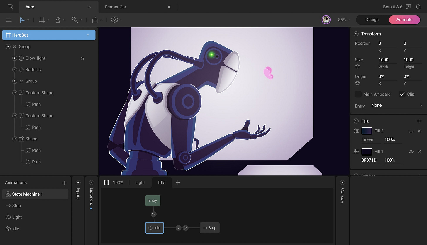
RIVE - Design and Build Production
Rive is a powerful design and animation tool that lets you create interactive, real-time animations for apps, games, and the web. With its efficient workflow and live preview, Rive empowers designers and developers to collaborate and bring dynamic designs to life. Perfect for creating engaging user experiences and a game-changer for modern animation. I can’t wait to try it out!
Figma Updated Eyedropper and Variables updates (Figma)
Figma’s latest updates make designing even smoother! 🎨
Eyedropper Tool (UI3):
• Reuse styles/variables (Shift + Click).
• Copy style names, hex/RGB codes.
• Tab through color formats.
• Create styles/variables (Shift + CMD/CTRL + Click).
Variable Updates:
• Copy/paste across collections.
• Hover to see values, descriptions, and groups.
• Improved accessibility and resizable columns.
Design Tool for AI Era (Motiff)
I came across Motiff, a cutting-edge platform that uses AI to transform how teams create and manage their brand and design systems. It makes collaboration effortless, streamlines workflows, and reduces manual effort—all while ensuring consistency across projects. With its AI-powered tools, Motiff helps teams create scalable, consistent design systems that efficiently preserve brand identity and take design processes to the next level.
Skill Sharpeners
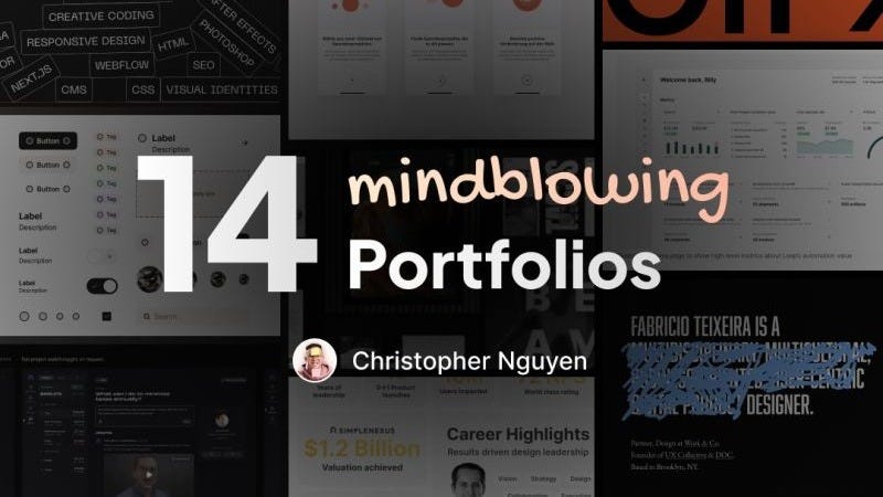
14 Mindblowing portfolios (Christopher Nguyen)
Christopher Nguyen shared a great resource: “14 Mind-Blowing Portfolios” — a curated collection of standout designs that showcase creativity, storytelling, and impactful presentation. Whether you’re building your own portfolio or simply looking for design excellence, this list is packed with insights and ideas. Check it out and get inspired!
I’ve started working with Framer and exploring its animation features. It’s amazing how intuitive and powerful it is, with tools like smart presets, interactive states, and timeline editing, making creating smooth, responsive animations a breeze. Perfect for turning ideas into interactive designs! 🤩
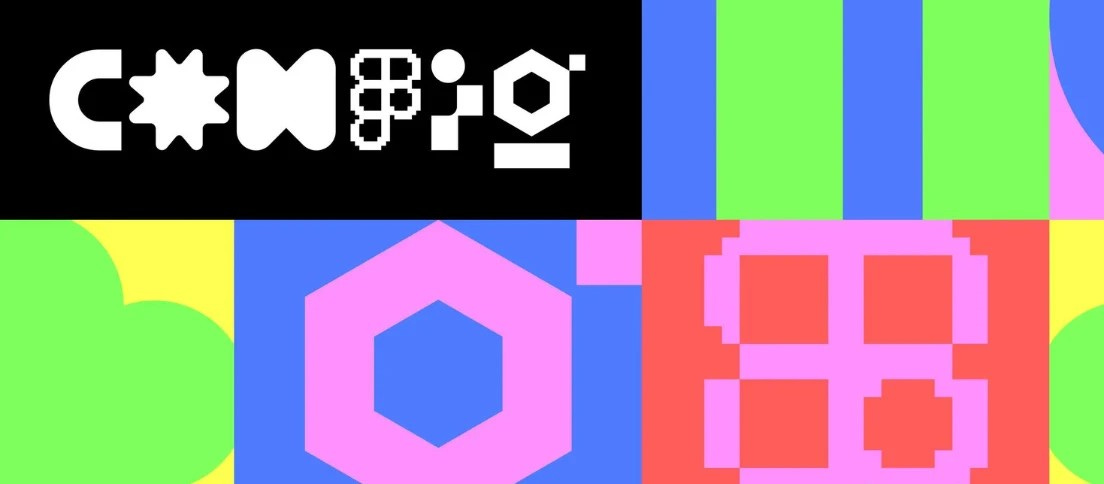
CONFIG - Figma's conference for people who build products (Figma)
Figma has opened early bird tickets for Config 2024—an amazing event to connect, learn, and get inspired by the global design community, with free virtual tickets also available for those who can’t attend in person!
Looking forward to connecting again next month! 🫶🏻 Many thanks for being a part of this journey! ☺️
Just a quick reminder about subscriptions – if you're not already on board, drop your email using the button below and join the fun (it's totally free)!


